The New Default. Your hub for building smart, fast, and sustainable AI software

Table of Contents
Effective documentation is key to any project's success, and as a developer, I’ve experienced it firsthand a number of times. With this blog post, I decided to share my journey with one specific type of documentation: diagrams. In one of my recent projects, I’ve focused on how diagrams can make a huge difference in clarity and communication. This article will walk you through my experience with diagramming, showing how these visuals can simplify complex ideas and keep everyone on the same page. Join me as I dive into the process and share some useful takeaways.

Not only do complex projects require clear and understandable documentation
As in any project, creating transparent documentation plays an important role. Documentation is a key factor in successful project development, serving as a guide for both technical and non-technical team members. Whether you’re working on a large-scale software development or a small internal task, transparent documentation is a vital guide for everyone involved.
Well-developed documentation ensures that all team members have a common understanding of the project's workings, goals, and the steps being taken to achieve them. Moreover, clear documentation reduces the risk of miscommunication and confusion, which can otherwise lead to costly errors or delays. This clarity streamlines communication, enhancing teamwork and ensuring every team member has the necessary information.
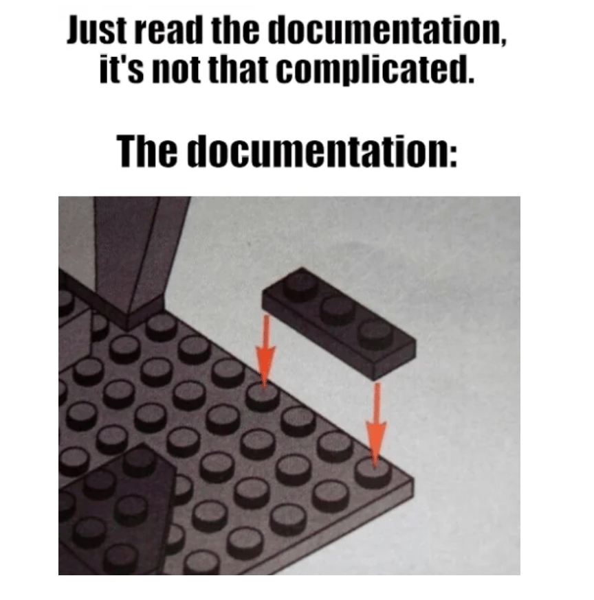
Image source: reddit.com/r/ProgrammerHumor
Why a diagram instead of plain text?
The use of visual representations might increase the effectiveness of communicating information compared to plain text. Visual aids enable team members to quickly grasp key project details, leading to faster and more effective comprehension.

Image source: favourite pie chart ever
Diagrams, in particular, offer a clear visual depiction of a project's structure, making it easier for the team to understand complex concepts and the relationships between different elements. When project details change, updating diagrams is often quicker and more straightforward than revising traditional text documentation.
It seems that many of us, even those who may not consider ourselves skilled artists, prefer drawing to writing. For instance, back in school, rather than taking notes, many of us would doodle at the edges of our notebooks as a more engaging and enjoyable activity. This preference for visual representation over text underscores the power of diagrams in making information more accessible and engaging.
Keeping documentation up to date
It’s clear that documentation is crucial for the smooth operation of any project, and continuous improvement is essential for keeping it relevant and useful.
However, let's consider a scenario where this isn't happening...
In my experience, one simple yet effective practice for maintaining up-to-date documentation is to include revision dates. This approach isn't just beneficial for diagrams; it applies to all forms of documentation. You can easily track changes by clearly marking when updates were made and ensuring everyone is working with the most current information.
Real-life example:
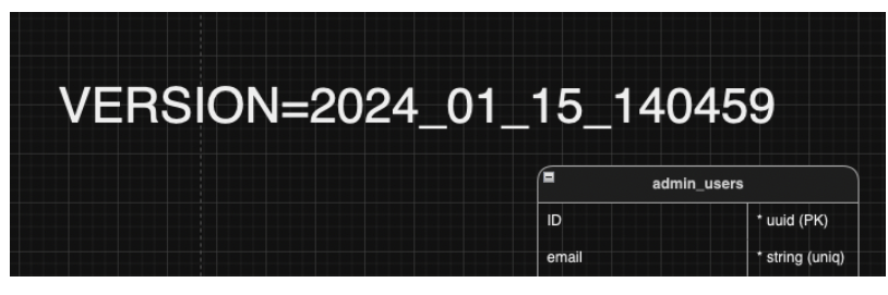
As you can see, we use diagrams to represent the current state of the database, with the Rails migration file name indicating the date of the last documentation update. While this approach doesn’t address every issue, it proves highly beneficial when managing a complex project with limited time for documentation updates. When deadlines loom, having a clear reference point in the documentation allows us to pinpoint the stage at which we last quickly made changes, streamlining the process of catching up and ensuring accuracy.
Standardization
Introducing standards for diagramming is essential for maintaining consistent and comprehensible documentation across your project. By establishing clear guidelines for how diagrams should be created and interpreted, you ensure that all team members can easily understand and utilize the visual aids, regardless of their familiarity with the project. Creating a diagram legend can significantly enhance the clarity of your documentation. A legend is a key to decoding symbols, colors, and notations used within the diagrams, making it easier for anyone who references them to grasp their meaning quickly.
Real-life example:

Standardization is crucial for effective diagram-based documentation, but from my own experience, its benefits become clearer as the project and the documentation evolve. Numerous factors influence the process, which means rigid adherence to standards might not always be practical or beneficial.
If following current standards makes the documentation process troublesome, consider deviating from the established norms when necessary. Instead, focus on adding clear, descriptive comments that explain the "what" and the "how" of your diagrams. This approach can make your documentation more flexible and tailored to the specific needs of your project, ensuring that it remains understandable and useful as it develops.
Choosing the right tools
Choosing the right tools for diagramming is essential for effectively integrating visual representations into your project documentation. The right tools can significantly enhance the clarity, accuracy, and overall quality of your diagrams.
When selecting diagramming tools, consider factors such as ease of use, compatibility with your project management tools, and the ability to create various diagram types, from flowcharts to network diagrams. The tools should also support collaborative features, allowing team members to contribute and provide feedback seamlessly. Additionally, look for tools that offer customization options to align with your project's specific needs and standards.
Here are a few examples of tools I’ve been using and find them worth considering:

Image source: drawio.com
Diagrams.net (Windows, macOS, Linux, Web) is a versatile, cross-platform diagramming app that caters to a wide array of diagramming needs and is the most tightly Google Drive integrated diagramming application available. Developed in HTML5 and JavaScript, it enables the creation of flowcharts, UML diagrams, wireframes, organizational charts, and network diagrams. Key features include online and offline access, compatibility with cloud storage services like Google Drive, Dropbox, and OneDrive, and a strong focus on user privacy with no data storage on its servers. It offers real-time collaboration, a rich set of pre-built templates, and extensive customization options. Additionally, diagrams.net integrates seamlessly with applications such as Atlassian Confluence, Jira, and Notion, making it a flexible and secure choice for various diagramming tasks. Can import from .vsdx, .vsd, Gliffy, and Lucidchart files.

Image source: miro.com
Miro (Web) - Miro is a dynamic online whiteboard team collaboration and brainstorming platform. Ideal for individual work and team sessions, agile workflows, user story mapping, and design thinking, Miro provides an interactive digital canvas where teams can work together in real time. It features a vast library of templates for mind maps, flowcharts, and project planning and integrates with popular tools like Slack, Google Drive, and Microsoft Teams to streamline workflows. With its intuitive drag-and-drop functionality and user-friendly interface, Miro is well-suited for remote teams and interactive workshops, facilitating practical and engaging collaborative sessions.
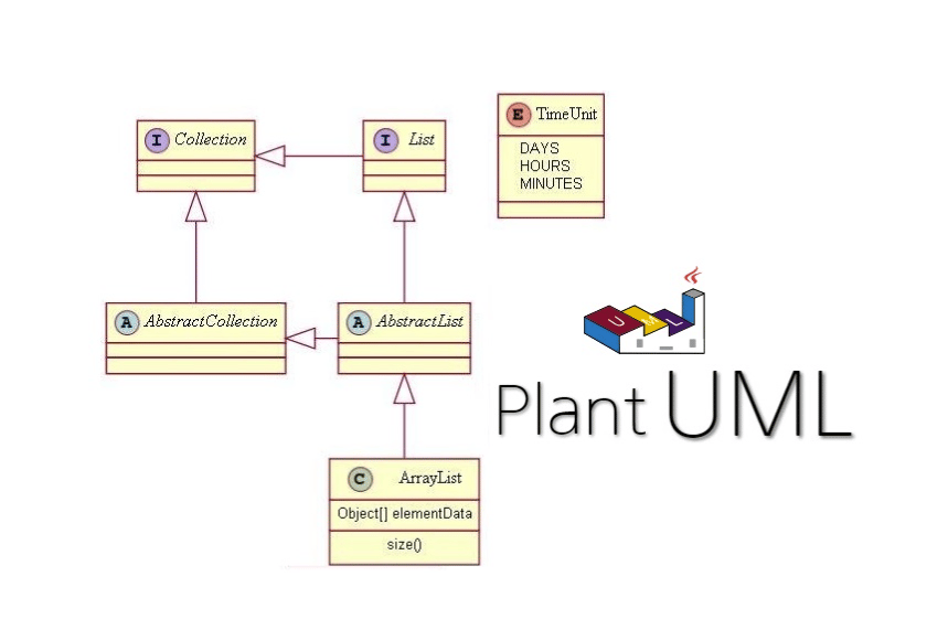
Image source: medium.com
PlantUML (Windows, macOS, Linux, Web) - PlantUML is a robust, free-to-use, text-based diagramming tool that allows users to create a wide range of diagrams through simple, human-readable code. Supporting flowcharts, sequence diagrams, use case diagrams, class diagrams, and more, PlantUML offers a unique approach to diagramming by generating visuals from plain text descriptions. Key features include integration with various development environments and tools such as IDEs, wikis, and CI/CD pipelines, as well as compatibility with multiple formats for diagram export. PlantUML's focus on text-based input and automation makes it especially popular among developers and technical teams looking for a streamlined, code-centric approach to diagramming. Its open-source nature and extensive community support contribute to its versatility and ongoing improvement.
There are plenty of diagramming tools for various needs and preferences. Here is a short list of the most popular ones to consider:
Lucidchart - Known for its intuitive interface and smooth performance, Lucidchart caters to all skill levels. It provides a comprehensive set of shapes and templates, excellent collaboration features, and integrations with many popular apps, making it a versatile choice for beginners and experienced users.
SmartDraw Cloud - This tool boasts a vast selection of templates and objects and the helpful Smart Panel feature that guides users through the diagramming process. Its strong integration options and user-friendly design make it an excellent choice for various diagramming needs.
Mural (Windows, macOS, iOS, Android): Mural stands out with its modern, professional-looking templates, which are ideal for business processes, meeting planning, and presentations. It also includes group video calls, text chat, and Zapier integrations, enhancing team collaboration and communication.
FigJam - A cost-effective option suited for simple diagrams, wireframes, or charts. FigJam’s affordability and ease of use make it an excellent choice for teams seeking a straightforward diagramming solution.
Flowcharts and mind maps for effective decision-making
Clear and effective visualization tools are essential when tackling complex problems or planning processes. Diagrams, such as flowcharts and mind maps, offer invaluable assistance by breaking down decision-making paths and process flows into manageable, visual segments. Diagrams help with exploring options, evaluating potential solutions, and understanding the sequence of steps. You will find several diagram examples that I find especially useful in my daily work.
Process flowchart
This process flowchart diagram maps out various pathways depending on specific conditions. It effectively illustrates how different decisions or steps lead to diverse outcomes, making it easier to understand the flow of activities and how one decision impacts the next. It’s particularly helpful in scenarios like workflow management, decision trees, or any situation where a clear visual representation of options and their consequences is needed.
Mindmap aka decision-making flowchart
This diagram is a decision-making flowchart or a mind map structured to explore different options, considerations, and outcomes related to a specific problem. It is divided into sections that pose questions, evaluate possible solutions, and weigh the pros and cons of each option. The pattern used in this diagram helps break down complex decisions, especially when multiple factors or scenarios need to be considered. It helps in systematically analyzing various possibilities before concluding. This approach is particularly beneficial in planning, strategic decision-making, or problem-solving tasks requiring clarity and thorough evaluation.
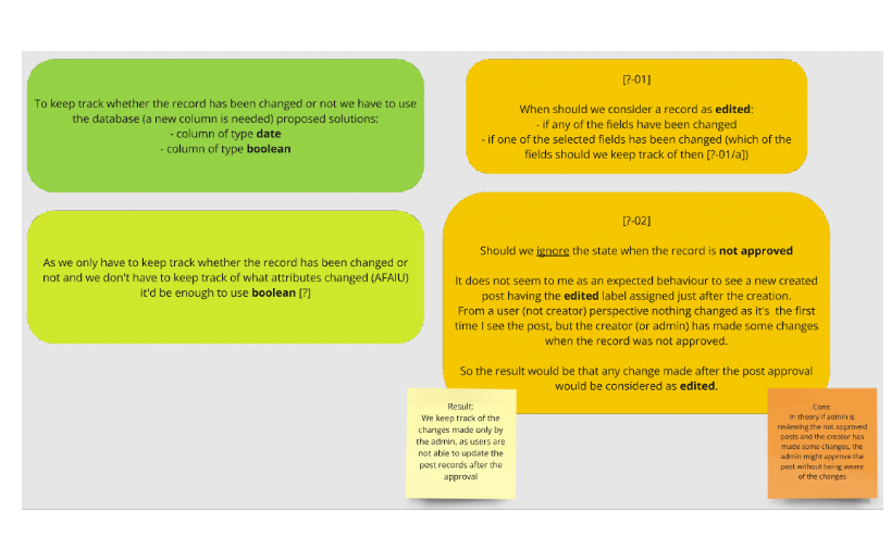
TIP: As you can see, the questions are labeled in a specific way - [?-01], I recommend implementing a similar system to make it easier to refer to the questions later when talking to other team members.
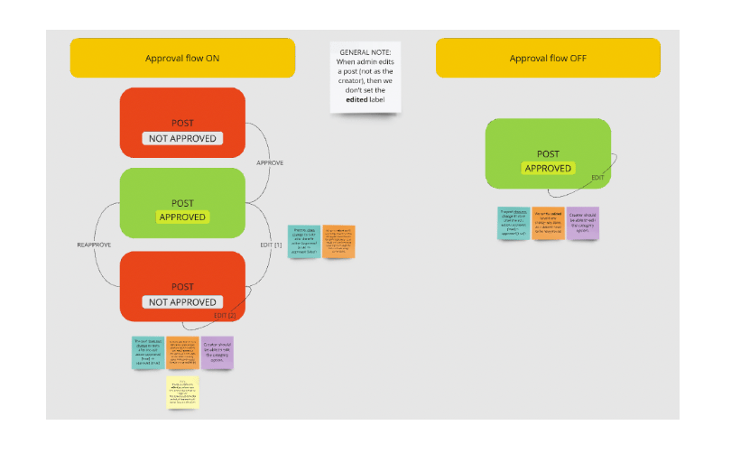
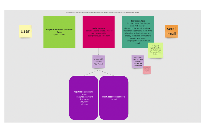
Sequence of steps flowchart
This diagram is a flowchart that details the sequence of steps. It focuses on the flow of information and actions from the initial user input through various system processes. Unlike diagrams emphasizing state changes and edge cases, this one is centered on visualizing the entire flow, showing how different parts of the system interact and progress from start to finish. This pattern helps understand and communicate the overall process structure, ensuring that all steps and interactions are mapped out and easy to follow. It’s ideal for planning, process optimization, and ensuring all flow elements are correctly aligned and executed.
Enhancing documentation and team communication with diagrams
To wrap things up, effective documentation is absolutely crucial for keeping projects on track, and diagrams can make a world of difference in how we communicate complex ideas. Throughout this article, I’ve provided various examples of how visual aids like diagrams can simplify information and help everyone on the team understand what's going on, no matter their technical background. Choosing the right diagramming tools can make your documentation more efficient and impactful.
Using diagram tools can streamline communication, improve teamwork, and make managing projects much smoother. As you apply these ideas to your own work, remember that clear, visual documentation can keep your team synchronized and informed, leading to better project outcomes. I hope I have encouraged you to start using diagrams as project documentation or to simply outline for yourself the current task you are working on to make it easier for yourself and the person doing the code review.

Patryk Gramatowski
Ruby on Rails Developer
Patryk Gramatowski is a detail-oriented software engineer with extensive experience in designing and developing dynamic, high-performance web apps with Ruby, Ruby on Rails, and other technologies. He’s deeply committed to building secure, scalable, and maintainable software solutions that meet technical and business objectives.